Saturday, October 19, 2013

The effects of time

OK, you have thought about your next work of art and this time it will be a painting/sculpture/model/carving/etching, or whatever.
?
?
?

[Latest update to this post: 20/03/14]

This thought process has taken up time ranging from several moments to perhaps even years.
...and next - you begin.

Each activity is time consuming to a lesser or greater degree but that simply relates to those activities.
Yet the passage of time has varying impacts on the art itself which may be so slight as to be unnoticeable through to being so impacting that the art is destroyed.


What am I referring to?
The art form, the materials and the finished product are all susceptable to the passage of time to varying degrees.
Even before use, paint drys or becomes discolored or even unusable having a defined lifespan affected by the end result of its manufacturing process - a shelf-life if you like, which is not always indicated or referred to on the product directly.
It is also affected by environmental conditions such as temperature, humidity, ambient light conditions, atmospheric and physical conditions.
Examples of such impacts:

  • A hot, dry studio may dry out the clays and paints used by sculptors and painters.
  • A humid environment may ruin the base material used in clothes making.
  • A liquid paint applied to a vertical surface like a painting canvas may suffer from gravity impacting the end result as the paint dribbles down the canvas - admittedly sometimes desirable - but not always.
  • Colors may fade quickly and unevenly if the light is strong or of a particular type - e.g. direct sunlight.
  • An artists studio suffering from airborne smoke or other particles, or from (say) repeated strong noise and vibration from a nearby train, aircraft or even day to day road traffic may damage or ruin a given piece of art.
  • Other airborne particles or chemical makeup may impact upon a piece of work.  The airborne particles could be dust and dirt, grass cuttings, hair or fur from for example a pet dog or cat.  The chemical makeup could be as simple as cooking smells and joss sticks through to deodorants and perfumes - or chemical output from a nearby factory.
  • Whatever the case its impact upon artwork may not just be slightly damaging - it could ruin it either in the short term or over time.


Sunday, July 3, 2011

Imagine and Image

Imagine and image.
It sounds simple but may not be as simple as you think unless you are a well practised artist or have a particularly good memory for detail, depending how far you are going to go with it.
Bear with me and see what I mean.

Start with an easy one.

Imagine someone you admire a great deal such as an actor, actress, pop star, politician (yes, surprisingly to some, there are those who do admire these), sports personality etc. but do not include a close relative or friend.

Without any preparation or having any direct reference to them with you, just imagine their face for a moment - a front view and not a mirror image of it.
This is easy, after all they are someone you really like and have seen them perhaps hundreds of times at the cinema in films or on television, in action or in still images, on the Internet, in magazines and newspapers etc., you may even have their picture as a poster on your wall at home or in a club.

Now, think of their temples; the soft indent on the side of their head level with their eyes.
Now picture only the left temple.

If they have a particularly noticeable blemish or feature such as a beauty spot, mole, pigment patch or something of that nature on their temple - discard it, forget about it.

Now imagine the next most noticeable feature of that left temple on the side of the head of your choice of actor, actress, pop star, politician, sports personality etc.

What is it and where is it?

At this point most people will draw a blank, they may even not have 'noticed' any particularly noticeable feature on the temple anyway because that is not how our mind works.  We have a tendency to form a general impression with the salient features noted mentally but when it comes to finer detail we have no need to know, so mentally flush it.

This can also be demonstrated by yourselves by thinking of a visit to a hotel on a short visit such as a weekend break. Obviously this will work better if you didn't visit very recently but even recent events can apply.
You probably remember the room and its layout and style - but can you remember the pattern and colors of the carpet outside the room, or if there was no carpet what was there instead?
With this question it may be a lot easier if there was some specific reason why you might remember that flooring such as dropping something onto it that broke or some feature that embedded it in your memory but you probably get the gist of where I'm coming from.

For most of us, the memory can only cope with so much.  To some extent this can be improved with memory training, of which there is plenty available either freely or at cost from a variety of sources but there are is a minuscule number of people indeed who genuinely have a seemingly limitless capacity to remember 'everything' - and I am not writing about those with a photographic memory.  There are those who do remember virtually everything from a very early age, some even well before their teens, who can recall, without great effort, everything from the day to the place and the event with all the details.

What is your capacity to remember?

Saturday, June 18, 2011

The Dark

Subjects cast in darkness and shadow succeed as images because like with a book that you read and your own imagination lends itself to completing the storyline, filling in gaps and fulfilling the whole, your mind will imagine things in the darkness and shadows.

You will interpret what your eyes see in a host of differing ways depending on the image, the setting, the lighting, what you may have experienced during your life, even what has happened recently, your mood, comments from others, etc,. etc.

Always consider that though your mind will imagine things in the dark and shadows, it will not be the same as that imagined by others.
They say beauty is in the eye of the beholder - it is.
That is because interpretation is all; whether beauty or otherwise, and interpretation is very much an individual concept.

A simple photograph of rocks in the sea may appear to be just that but at first glance appear to be something else.  It may be that at first glance it does appear to be rocks in the sea but when really looking into the image then it may appear to be something else.

A dark image makes the mind work, it teases out guesses and assumptions, it leads from one idea to another until it decides yes, this is what this is! Though this may be far from what it really is.

The dark is light.
The dark is a place some don't want to enter.
The dark can be foreboding.
The dark is not always black.
Non-dark characteristics can provide emphasis to the darkness.

What next?

Using the dark for emphasis is not new by any means.
It has been used by artists and designers for millenia - a few simple examples are given below:

In 'Colors of Ancient Egypt' (Alistair Boddy-Evans) to the ancient Egyptians black was the colour of the life-giving silt left by the Nile flooding, which gave rise to the Ancient Egyptian name for the country: 'Kemet' – the black land. It symbolized fertility, new life, and resurrection as seen through the yearly agricultural cycle and was colour of Osiris ('the black one'), the resurrected god of the dead.  Black was also the colour of the underworld where the sun was said to regenerate every night and was often used on statues and coffins to invoke the process of regeneration ascribed to Osiris. Black was also used as a standard colour for hair and to represent the skin colour of people from the south – Nubians and Kushites.

The Nazca (sometimes referred to a Nasca) culture of Peru's southern coastal region in South America (300 BC and AD 800) created the world famous Nazca lines; geometric drawings of animals, birds and shapes only fully recognizable from the air. The lines were made by scraping away dark upper surface stones on the surface of the ground to reveal a lighter material beneath. 

Leonardo da Vinci (1452 - 1519) is credited with "The eye which turns from a white object in the light of the sun and goes into a less fully lighted place will see everything as dark".
He also wrote that a painter should begin every canvas as a wash of black, because all things in nature are dark except where exposed by the light."


Variation on a theme

The same - but different

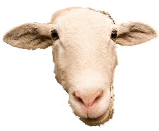
The same image displayed in a modified manner can make a world of difference to art and design whether prominent or subtle.

In this obvious example, this cute sheep's head is displayed as a mosaic of tile pieces and also as a plain photographic image.


What will such variation do?

Changing the form even if not the image can produce a surprising array of results.
Try experimenting yourself - take an image, turn it into a silhouette, or perhaps shrink it and use the tiny imagery as the 'dots' to make up a larger image of some sort.
Whatever your ideas, just try them out and see what you get!


A chicken you know, may know or a stranger in your flock?

Another example is this colour image of a chicken.
The image shows the vibrant colour range of the feathers that would enable an owner to recognize it among a flock of other chickens, even if they were of the same breed with similar colouring.

The same image repeated below but using a filter so only grey scale is visible induces anonymity, that is to say the individuality of the chicken becomes so much harder to identify - the characteristic of colour has been reduced to 'colours' from black through to white - various shades of grey.

If this was now placed in among a flock of chickens with similar colouring, picking it out would be considerably harder - it has moved toward becoming anonymous.

Taking this another step further, we can also show the same chicken as a silhouette, an all black image of the original.
The characteristics of colour that originally had helped identify the chicken, which when shades of grey made identification harder has now limited identification down to the shape only.
If it was seen from various angles other than sideways on as in this example, it may not be identifiable at all - even as a chicken.

Finally in this little set piece, we have the white chicken - a negative of the silhouette.

The appearance, albeit the same other than being a switch from black to white, without seeing them side by side, may seem like a completely different bird.

Perception is in the eye of the beholder and interpretation is very much an individual concept.


Saturday, June 12, 2010

Ongoing work

In the process of living, new ideas and visions spring forward all the time.

New tools may help to inspire too - a piece of software allowing for the development of ideas previously stuck in the mind, may open up a whole new range of possibilities then prompting even more new ideas and visions - an ever expanding wealth of material...

Oh, what fun but oh, how little time to develop and output it all!

Sunday, September 20, 2009

Stronsy Art and Design

Stronsy is an artist and a designer.

Stronsy's work includes - but is not limited to:


Photography
Images of everyday objects through to some very unusual imagery even though none of the photographs are modified.

Design
From graphic designs to cartoons.

Drawing and Painting
Both the subject matter and the media are quite varied and includes wildlife and dream scenes, science fiction and graphic contrasts with pencil, ink, water colours, oils and acrylics on paper, card, canvas, wood and more.

Modelling
Work in plasticine, clay and wood with topics such as wildlife, portraits and religious symbolism.

Wordsmithing
The artful use of words and the design of cleverly constructed phrases using a fun filled imagination.

Where can Stronsy works been found?
One very broad range of Stronsy's artistic ideas and design ideas can be found on the following site: www.zazzle.com/stronsy*
Using this site, all Stronsy products can be customized by you e.g. sizes, colors or styles.
This can be tried out without having to buy anything.
You don't have to buy it to try it and on this site what you see is what you get!

Where else?
A smaller selection of Stronsy's work can be found on the Red Bubble site here:
http://www.redbubble.com/people/stronsy